Atlas Corps
Branding | Web
A rebrand focused on infusing fresh energy into their mission of developing global leaders and driving social change.
The goal was to align the visual identity with the company’s mission while creating an engaging, user-friendly online experience. The project included a full rebrand of the new identity into a revamped website.
Branding:
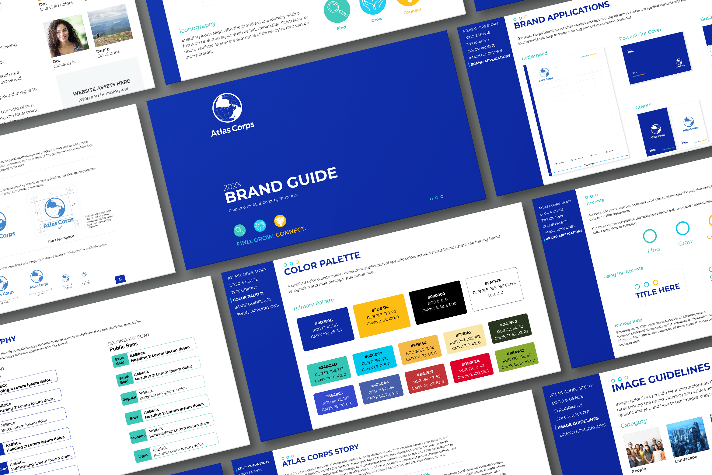
Establishing a cohesive visual identity involved creating detailed brand guidelines to guide future designs. Key elements included:
Updated Color Palette: Vibrant, modern colors to convey energy, trust, and Atlas Corps’ impact.
Typography: A clean, modern typeface that is professional, approachable, and highly readable.
Graphic Elements: New graphics designed for consistent use across all branding.

Website Redesign:
With the new branding guidelines in place, the goal was to create a website as impactful as the organization itself. Key improvements included:
Clean, Modern Design: A cohesive, fresh look using the new branding.
User-Friendly Interface: Simplified layout, intuitive navigation, and clearly defined sections for easy access to key information.
Mobile Optimization: Fully optimized for a seamless experience across devices.
Impactful Visuals: Bold images and graphics to communicate the organization’s global reach.

Outcome & Takeaways:
The rebranding and website redesign significantly enhanced Atlas Corps’ digital presence and brand cohesion, establishing:
A cohesive visual identity that strengthens the brand and aligns with its core mission.
A modern, mobile-optimized website to boost engagement and accessibility.