
Reach, Cure, Prevent
Branding
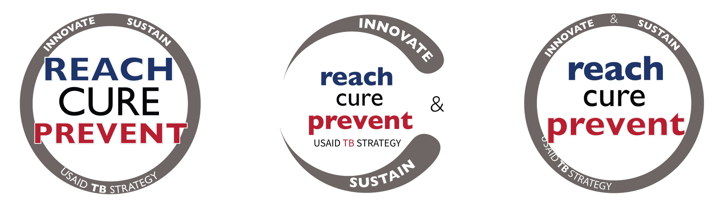
Visually representing the mission to innovate, sustain, and eliminate, emphasizing the key goals of “Reach, Cure, Prevent” in a clear, adaptable design.
The goal was to create a logo that was impactful and adaptable for use across various media, reports, presentations, and websites.
Design Process
The process was highly collaborative, aiming to create a meaningful, simple visual representation of the USAID TB Strategy’s priorities. Key considerations included:
Symbolism: A logo that embodies the TB strategy while being adaptable.
Color Palette: The blue and red scheme was intentional, blue represented innovation, while red symbolized sustainability, reflecting the strategy’s dual focus.
Shape & Structure: An enveloping circle surrounds “Reach, Cure, Prevent,” symbolizing unity and the initiative’s scope.
Outcome & Takeaways
The final logo effectively communicates the strategic priorities with a bold design. The red and blue colors reinforce themes of progress and commitment, while the logo has been successfully integrated across multiple platforms, including the USAID TB Strategy website.